
Choosing Angles and Composition for Ecommerce Product Photos
For ecommerce product photography, choose the camera angle by the product information the image must reveal: use a front view for front-facing details, a three-quarter view when front-and-side depth matters, a side or back view for hidden surfaces, and an elevated or top-down view for upper features. Then compose and crop for a clear focal point, correct exaggerated near-to-far perspective by increasing camera distance and reframing, and add supporting views only when they reveal new product information.
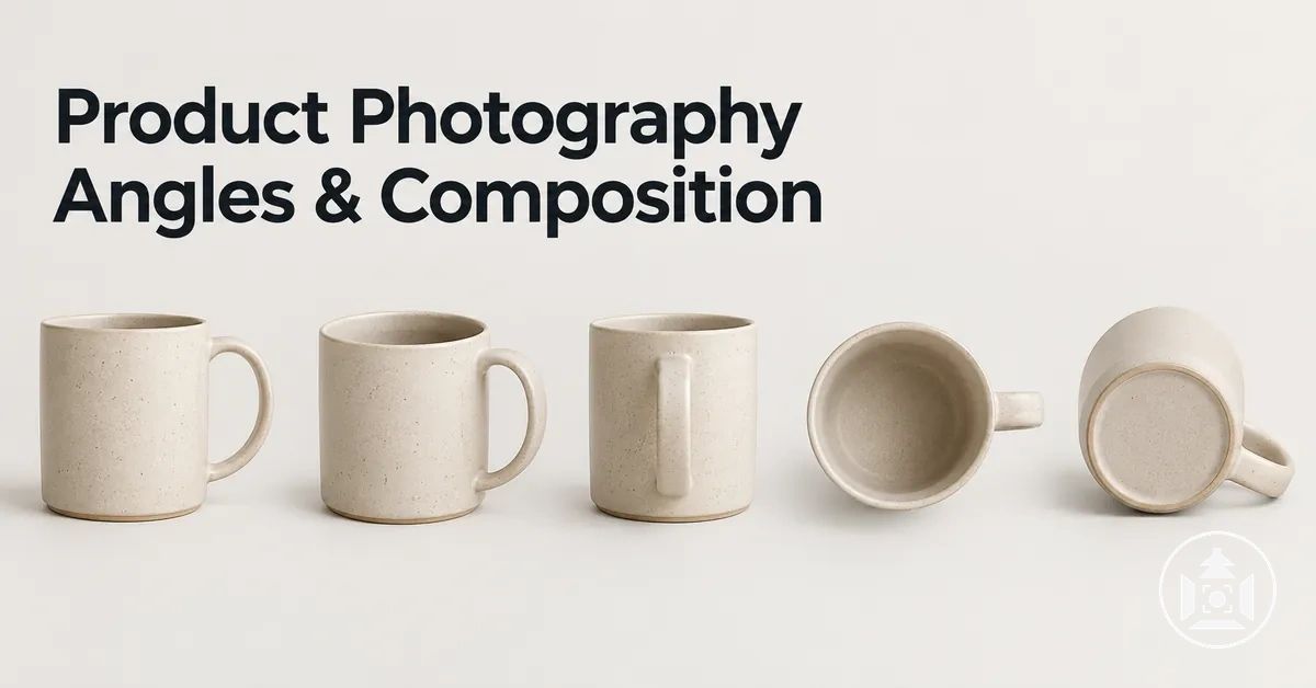
Angle and composition decision guide
Start with the product information the image must reveal, then verify perspective, composition, and sequence coverage.
Then verify the shot
- Perspective: if near-to-far proportions look exaggerated, move the camera farther back and then restore the intended crop.
- Surface visibility: adjust camera height and alignment so the highest-priority surface remains readable.
- Composition: favour centred placement for symmetry and neutral emphasis; use off-centre or rule-of-thirds placement when directional space or context needs room.
- Sequence: keep a supporting view only when it adds a new surface, feature, proportion, relationship, scale cue, or necessary detail.
The final angle is conditional on product geometry and information need; a familiar camera position is a starting point, not a universal rule.
Angle, composition, and framing are separate controls: the viewpoint changes which surfaces are visible, composition changes visual priority, and framing changes how much of the product and surrounding space appears. Use them together so each image answers a specific shopper need.
Table of Contents
How Angles, Composition, and Framing Work Together
Camera angle, composition, and framing perform distinct but connected functions in product photography.
The camera angle controls the viewpoint, determining which visible surfaces and proportions of the product appear in the image.
Composition controls how the product and other visual elements are arranged, while framing controls how the subject occupies the image boundary and surrounding space.
Together, these variables shape which product information receives visual priority.
Changing the viewpoint reveals or conceals different surfaces and can change how the product's proportions are represented.
Subject placement within the composition affects which product features receive attention, while a tighter crop makes the product occupy more of the frame and more surrounding space provides additional visual context.
The resulting prominence depends on the crop, product shape, and intended use of the image.
Camera angle, composition, and framing therefore contribute different parts of the same visual-information hierarchy.
An annotated view can separate these effects by showing the camera viewpoint, subject placement, and frame boundary on the same product image.
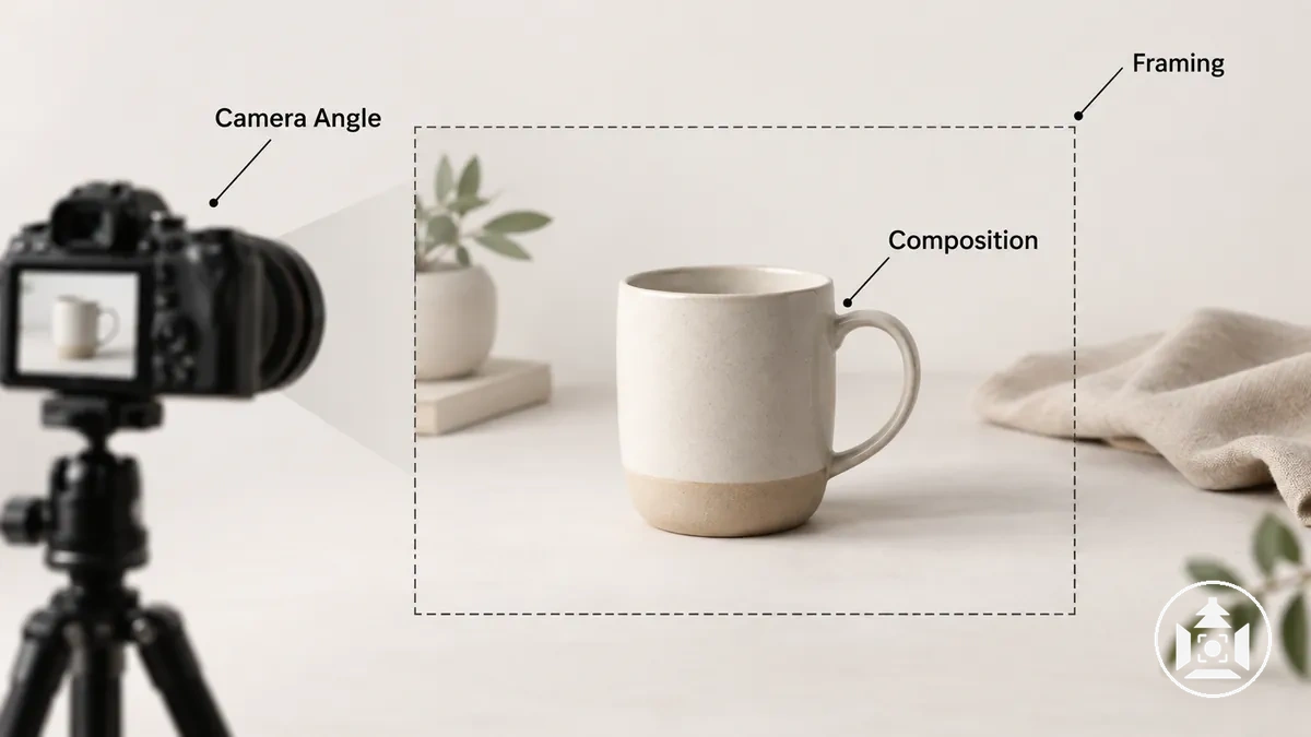
For example, keeping the same viewpoint and subject placement while tightening only the crop makes the product occupy more of the image without revealing a different surface; changing the camera angle instead can reveal different product information.
These connected choices sit within the broader practice of ecommerce product photography, where angle, composition, and framing work together to determine what the product image communicates.
Choose Camera Angles by the Product Information They Reveal
Choose a camera angle according to the product information and visible surfaces a shopper needs to understand, rather than treating one viewpoint as universally preferable.
Changing the viewpoint changes which surfaces, features, and spatial relationships are visible.
The appropriate choice therefore follows the product feature that needs to be shown and the product geometry that determines whether that feature can be seen clearly.
Start with the information to reveal, then select a viewpoint that can expose it without obscuring another relevant feature.
Each criterion below pairs a surface or feature with a camera position that can reveal it under the appropriate product geometry.
- Front-facing labels, controls, or identifying details: a straight-on front viewpoint can reveal information concentrated on the front surface when depth is not the main attribute to communicate.
- Depth and adjacent surfaces: a three-quarter viewpoint can show the front and side together, making depth and the relationship between those surfaces visible when the product geometry supports that view.
- Side profile or thickness: a side viewpoint can reveal profile, depth, protrusions, ports, or controls positioned on a lateral surface.
- Top surfaces and openings: a top-down or elevated viewpoint can reveal lids, openings, controls, texture, or other information located primarily on the top surface.
- Back features: a back viewpoint is appropriate when connections, labels, controls, closures, or functional surfaces on the rear contribute to shopper understanding.
- Low-positioned or underside-related features: a lower camera angle can reveal relevant surfaces that a level or elevated viewpoint would conceal, provided the resulting perspective still represents the product clearly.
Familiar labels such as front, side, top-down, three-quarter, back, and low-angle describe practical camera positions rather than rules for which angle to use.
A three-quarter view—often started around 45 degrees from the front—can be useful when front-to-side depth needs to remain visible, but it is not inherently the best camera angle for every product because different product geometry exposes different information from that position.
The comparison image shows how the same product can expose different front, side, top, and depth information as the viewpoint changes.
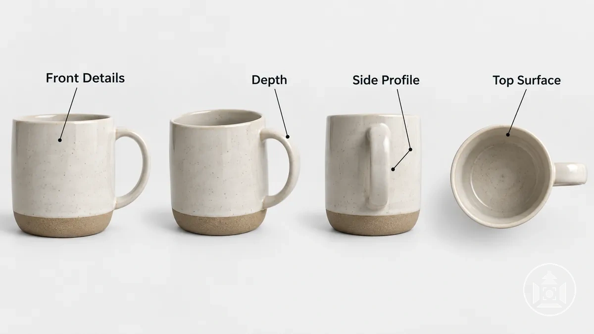
Camera-angle selection determines which product information a viewpoint can reveal; it does not define the broader categories used to organise product imagery.
Those neighbouring categories are covered separately under ecommerce product photo types and shot types.
Use a Primary Angle to Establish Shape, Orientation, and Key Features
The primary angle is the viewpoint that most clearly establishes the product's overall form, orientation, and highest-priority visible features in the first view.
Which camera position serves this role depends on the product shape and on where its important information is located.
The primary view should therefore prioritise accurate product communication rather than follow a fixed angle formula.
Evaluate whether the product face, depth, distinctive shape, label, controls, or a functional surface needs to be visible for the product to be understood correctly.
For example, a product with important front controls and meaningful depth may suit a viewpoint that keeps the controls readable while also showing enough of the side to establish its three-dimensional form.
The annotated primary view demonstrates how overall shape and orientation remain clear while a small number of key features receive visual emphasis.
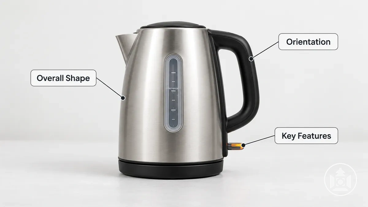
A primary angle is an informational role, whereas a hero shot often describes a more dramatic or promotional presentation.
A low-angle or other dramatic perspective can serve as the primary view only when it still represents the product shape, orientation, and key features clearly and accurately for the intended image use.
Add Supporting Angles Only When They Reveal New Features or Surfaces
A supporting angle is justified only when it resolves relevant missing information that the primary view leaves unseen.
Its purpose is to reveal a distinct surface, feature, product relationship, or scale cue rather than increase the number of product photos.
Evaluate each additional viewpoint by the information gain it contributes to the product's representation.
Match the unresolved information to a viewpoint that can make that attribute visible.
The criteria below evaluate information gain rather than shot quantity by distinguishing a supporting view that adds information from a viewpoint change that does not.
- Missing surface: use a supporting angle that exposes the relevant side, back, top, or other surface hidden in the primary view.
- Missing feature: choose a viewpoint that makes the relevant control, opening, connection, closure, or other feature visible.
- Unclear product relationship: use a supporting view that reveals how relevant parts, surfaces, or components are positioned in relation to one another.
- Missing scale cue: use a viewpoint that makes the relevant size relationship or proportion easier to interpret when the primary view does not show it clearly.
- No additional information: omit a near-duplicate viewpoint when it changes the camera position but reveals no relevant new surface, feature, relationship, or scale cue.
The comparison image shows how supporting views of the same product can expose a missing surface, feature, product relationship, or scale cue that remains unresolved in the primary view.
Keeping the product identity consistent makes the incremental information gain from each viewpoint clear.
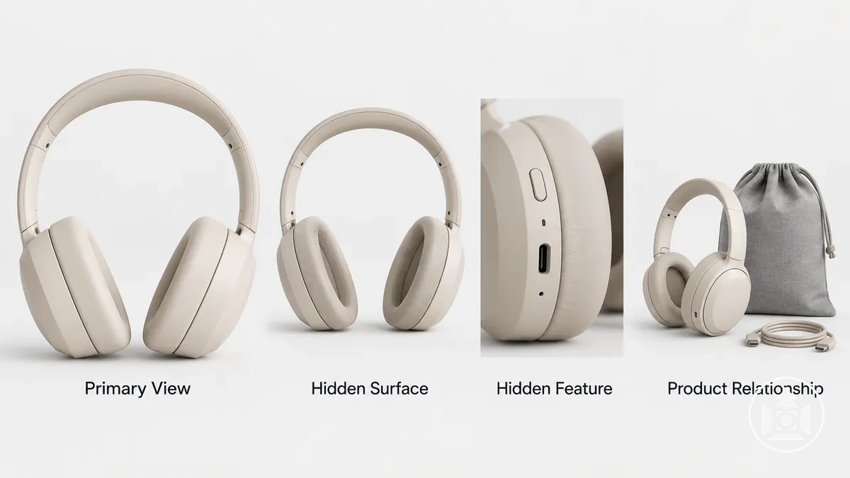
Local supporting-angle selection determines whether one additional viewpoint resolves missing information; full sequence-level redundancy auditing belongs to later coverage planning.
Product properties such as a reflective surface can change angle-selection requirements, but angles for reflective products require specialist handling beyond this subsection.
Control Camera Position to Limit Perspective Distortion
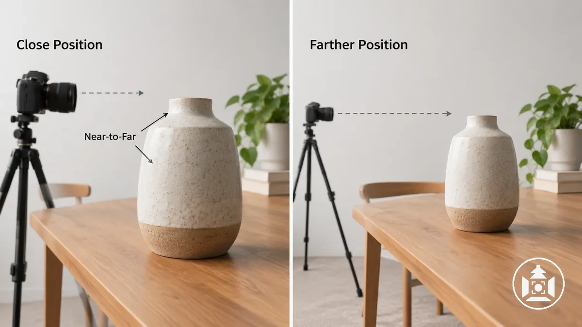
Camera position changes the perspective relationship between a product's near and far parts, so it can change their apparent proportions even though the product shape itself has not changed.
A close camera position can make nearer features appear disproportionately large relative to farther features, while a strongly off-axis viewing angle can make depth and surface relationships appear more exaggerated.
Unwanted perspective distortion should therefore be evaluated as a viewpoint relationship before it is treated as a lens or editing problem.
Camera distance controls the near-to-far relationship: moving the viewpoint farther from the product reduces the relative distance difference between its nearer and farther parts, so their apparent size difference becomes less pronounced.
Viewing angle and alignment also matter because an off-axis or misaligned camera position can make one side or end appear more prominent than another.
How much the subject fills the frame can make these effects more visually prominent, but subject fill alone does not define the underlying perspective relationship.
Camera position determines perspective, while optical distortion is a lens-related deformation such as barrel or pincushion distortion; the two should not be treated as the same phenomenon. Changing focal length from the same camera position changes field of view, whereas moving the camera changes the near-to-far perspective relationship.
The comparison image isolates camera position by showing the same product from a close and a farther viewpoint with a comparable intended viewing direction, making the change in near-to-far apparent proportions visible.
The table connects common camera-position conditions to the visible proportion effects that matter for accurate product representation.
The corrective direction is conditional: adjust the positional variable responsible for the unwanted effect while checking that important product surfaces and features remain represented clearly.
| Camera position or condition | Visible effect | What changes in the product | Corrective direction |
|---|---|---|---|
| Very close camera distance | Near-to-far size differences become more pronounced | Features nearer the camera can appear disproportionately large relative to farther features | Increase camera distance when a less exaggerated near-to-far relationship is needed, then reframe as appropriate |
| Strongly off-axis viewing angle | Depth and surface relationships appear more pronounced | The nearer side or end can dominate the apparent product shape while farther surfaces recede | Move the viewpoint toward a more aligned position when more even apparent proportions are required |
| Camera misaligned with the intended product axis | Opposing sides or edges can appear uneven in prominence | The product's apparent symmetry, orientation, or face-to-side relationship can change | Adjust camera alignment toward the intended product axis when that relationship needs more neutral representation |
Corrective camera position depends on the product shape, the surfaces that must remain visible, and the intended representation, so there is no universal distance or viewing angle that removes unwanted perspective effects for every product.
Adjust the viewpoint only far enough to control the relevant apparent-proportion change; lens selection and post-production correction are separate workflows outside this positional decision.
Match Camera Height to the Surfaces That Need to Be Seen
Choose camera height according to which product surface must remain visible and how the product geometry presents that surface to the camera.
Raising the camera elevation reveals more of a top surface or opening but can reduce the visual prominence of a front surface, while lowering it can favour front-facing and vertical features while obscuring upper or recessed areas.
The useful camera height is therefore conditional on surface visibility rather than a standard height or angle applied to every product.
Evaluate product height, depth, top-surface importance, label orientation, openings, and vertical features before setting the camera elevation.
Each criterion below links a geometric or informational condition to the surface visibility the viewpoint needs to maintain.
- Important top surface: use enough camera elevation to expose the relevant upper surface when its shape, controls, texture, or other visible features contribute product information.
- Front-facing label: keep the camera height appropriate to the label orientation so the front surface remains sufficiently visible and the label is not visually subordinated by an unnecessarily elevated viewpoint.
- Opening or recessed feature: raise the viewpoint when the opening or recessed area would otherwise be hidden by the product's front edge or surrounding structure.
- Greater product height: evaluate whether additional elevation would obscure important vertical features or change which front and top surfaces receive visual emphasis.
- Greater product depth: use sufficient elevation when relevant upper areas extend away from the camera and need to remain visible rather than being concealed by nearer product geometry.
- Important vertical feature: favour a camera height that keeps the relevant front or side area visible when that feature carries more information than the top surface.
The same camera elevation can therefore reveal different information on different product shapes.
A shallow product may need a higher viewpoint to expose a meaningful top surface, while a tall package with an important front label may suit a lower elevation that maintains stronger front-surface visibility.
Control Camera Distance When Close Positioning Exaggerates Product Shape
Increase camera-to-product distance when close positioning is causing exaggerated near-to-far apparent proportions.
Moving the camera farther back can reduce that perspective effect while the required viewing direction is maintained.
After increasing camera distance, re-establish the intended framing and product scale rather than treating distance as a universal correction for every distortion.
Use the sequence below to change camera distance while preserving the informational viewpoint.
Each step moves from observing the apparent proportions to positional adjustment, reframing, and final verification of product shape and visible surfaces.
- Assess the apparent proportions: compare the product's nearer and farther parts and identify whether close positioning is making the near-to-far size relationship look exaggerated for the intended representation.
- Increase camera distance: move farther back while maintaining the required viewing direction so the adjustment changes working distance without unnecessarily changing which product surfaces the viewpoint is intended to show.
- Restore product scale and crop: re-establish the intended framing after moving back, keeping the required viewing direction rather than changing it merely to make the product fill the frame again.
- Verify the result: reassess the apparent proportions, overall product shape, and visible surfaces before accepting the adjustment. If important surfaces become obscured or the unwanted proportion effect remains, the distance change alone has not produced an acceptable correction.
Compose and Frame the Product for Clear Visual Priority
Product composition and framing create clear visual priority when the product remains the unmistakable focal point while enough context is preserved to communicate its shape, scale, orientation, or intended use.
Composition controls where the product and supporting visual elements sit within the image, while framing controls how much of the product and surrounding space appears inside the crop.
Stronger product prominence does not always require filling the frame as tightly as possible.
Evaluate visual priority through the relationship between focal point, product scale, crop boundaries, surrounding space, balance, and directional cues.
These variables determine how strongly the product dominates the frame and whether useful context remains visible.
- Focal point: place and frame the product so its most important visible area receives attention before secondary visual information.
- Product scale: let the product occupy enough of the frame to remain dominant, while retaining surrounding space when that space helps communicate shape, direction, or use.
- Crop boundaries: keep the crop clear of important edges, features, or protrusions unless a tighter crop intentionally focuses on a specific detail.
- Surrounding space: use empty or negative space where it improves separation, directional clarity, or the readability of an elongated or asymmetrical product shape.
- Balance: distribute visual weight so the product does not feel unintentionally crowded against one edge or weakened by excessive empty space.
- Directional cues: account for the direction the product faces, points, opens, or extends so the framing leaves useful space where the object's orientation visually leads.
Composition rules are adaptable tools rather than fixed formulas.
Product shape and orientation change which placement, crop, balance, and amount of surrounding space are suitable; a tall vertical package and a long horizontal product create different visual-weight and framing requirements.
Centred placement, asymmetric balance, tighter framing, or more negative space can each be appropriate when they maintain product prominence and preserve the information the image needs to communicate.
For example, two identical products can feel different in prominence when one is tightly framed near the crop boundaries and the other is shown smaller with substantially more surrounding space; neither treatment is automatically preferable without considering the intended information.
Composition and framing remain separate from the choice between white background and lifestyle imagery, which determines the image environment rather than the local framing method.
Use Centred or Rule-of-Thirds Placement According to Product Shape
Centred placement and rule-of-thirds placement are alternatives whose suitability depends on product symmetry, directional shape, surrounding context, and intended visual emphasis.
In a rule-of-thirds layout, the frame is divided into three equal bands horizontally and vertically; placing the product or its focal feature near a one-third line or intersection creates an intentional off-centre emphasis while leaving usable space elsewhere in the frame.
Centred placement tends to support a stable presentation when symmetry and straightforward product prominence are important, while off-centre placement can support directional space or contextual room when the product visually leads toward part of the frame.
Neither placement is a universal composition rule.
Compare the two placement options using the same criteria: the product condition, the likely visual effect, and the context in which that effect supports the intended presentation.
The comparison keeps product prominence central while distinguishing when symmetry or directional negative space should influence placement.
| Placement option | Product condition | Likely visual effect | Suitable context |
|---|---|---|---|
| Centred placement | Strong symmetry, limited directional shape, or a product that benefits from equal surrounding space | Can reinforce symmetry, stable visual weight, and direct product prominence | Straightforward catalogue-style presentation or other images where the product itself requires the primary visual emphasis |
| Rule-of-thirds or off-centre placement | Directional shape, intentional negative space, or supporting context that requires room on one side of the product | Can create directional space and shift visual emphasis while keeping the product dominant | Images where product orientation or relevant contextual room makes asymmetric placement useful |
The rule of thirds is therefore an adaptable placement option rather than an inherently more professional choice.
Use either approach when its relationship to product shape, context, and intended emphasis supports clear product prominence.
Set Product Scale and Crop Around a Clear Focal Point
Set product scale and crop so the focal point is easy to identify while every product feature the image needs to communicate remains inside the framing boundary.
The subject-to-frame ratio should provide enough product prominence for relevant details to be inspected without forcing important edges or features against the crop.
The appropriate ratio and safe margin depend on product shape, required feature visibility, and the context the framing must preserve rather than a fixed percentage.
Evaluate product scale by checking whether the product is large enough in the frame to remain the clear focal point without losing necessary surrounding space.
Keep a safe margin around important product edges, protrusions, openings, labels, or other features when cropping them would remove information needed to understand the product.
Tighter framing increases the product's occupancy of the frame, but an overly tight crop can cut off relevant features or remove useful product context; looser framing preserves more surrounding space, but an excessively small subject can weaken product prominence and make important features harder to inspect.
For example, framing that clips a relevant product edge is too tight for complete feature visibility, while framing that leaves the same product unnecessarily small is too loose when the surrounding space adds no useful context.
Use Negative Space Without Reducing Product Prominence
Negative space is the unoccupied area around the product within the frame.
Purposeful negative space can reduce visual clutter, separate the product from surrounding elements, and give focal attention a clearer place to settle.
Its usefulness depends on preserving product prominence rather than simply increasing the amount of empty space.
The useful amount and direction of negative space depend on product size, orientation, directional cues, surrounding space, and any intentional layout allowance.
A product with a clear directional cue can use more empty space in the direction it faces or extends when that space supports the composition, while a non-directional product may not need the same imbalance.
Space reserved for text or another planned layout element can also justify additional surrounding emptiness when the product remains visually dominant.
Purposeful negative space therefore supports separation or directional emphasis, whereas excessive empty space that merely makes the product too small weakens product prominence.
Balance Visual Weight Around the Product's Shape and Direction
Visual weight is the perceived balance created by the product's size, product shape, orientation, tonal density, colour mass, and directional movement within the frame.
These cues can make one area of a composition feel more prominent than another even when the product remains the clear subject.
Evaluate mass-related cues such as size, tonal density, and colour mass separately from directional cues such as orientation and implied movement, then consider how they work together to support product clarity.
Mass-related cues can contribute to stability, crowding, or top-heaviness according to where visually prominent parts of the product sit within the frame.
Directional cues can create imbalance when the product's orientation or directional movement leads toward an area with insufficient counter-space.
Product shape changes these relationships because a tall, wide, or asymmetric form distributes perceived weight differently across the composition.
The criteria below connect each visual-weight cue to its likely balance implication, allowing the frame to be evaluated without assuming a universal balance formula.
- Product size: a product occupying a visually dominant area of the frame can carry greater visual weight, so surrounding elements and counter-space should remain subordinate without making the frame feel unnecessarily crowded.
- Product shape: a tall or strongly asymmetric form may need sufficient counter-space around its extended or heavier-looking area to avoid an unintentionally top-heavy or one-sided composition.
- Tonal density: a dark or visually dense area can contribute more perceived weight than a lighter surrounding area, so its position should be evaluated in relation to the rest of the product and frame.
- Colour mass: a concentrated block of visually prominent colour can increase the perceived weight of that part of the product, particularly when the surrounding frame contains less competing colour mass.
- Orientation and directional movement: a product that points, opens, leans, or visually extends toward one side may benefit from counter-space in that direction when it prevents the composition from feeling crowded against the frame boundary.
For example, shifting a tall product slightly toward the edge can change the balance if its height and directional movement leave too little counter-space on the side toward which the form visually extends.
The useful adjustment is the one that restores product clarity and a stable relationship between perceived weight and surrounding space, not conformity to a universal balance formula.
Plan Angle Coverage as a Coherent Ecommerce Image Sequence
Plan angle coverage around the product information the ecommerce image sequence must communicate, not around a fixed number of photos.
The primary view should establish the product clearly, while supporting views should add information that the first view does not show.
There is no universal shot count because the required number of views depends on product complexity and the amount of relevant information that remains unseen.
Begin by identifying the required product information, then choose the primary view that establishes the product most clearly.
Compare that view with the requirements to identify missing surfaces or features, and assign supporting views only where they add that missing information.
Keep the image sequence in a usable order so each viewpoint contributes to coherent angle coverage rather than unnecessary repetition.
Finish with a sequence check that verifies the required information is covered and redundant views have been removed before the sequence is accepted.
- Identify required product information: list the surfaces, features, proportions, openings, controls, labels, or other details that shoppers need to understand from the image sequence.
- Choose the primary view: select the viewpoint that communicates the overall product shape, orientation, and highest-priority visible information most clearly.
- Identify missing surfaces or features: compare the primary view with the required information and note which relevant surfaces, features, or relationships remain unseen or unclear.
- Assign supporting views: add only the viewpoints needed to reveal that missing information, keeping each supporting view tied to a distinct information gain.
- Verify coverage and redundancy: perform a sequence check before accepting the set, confirming that required product information is covered and that no view repeats another without adding useful information.
Product complexity determines how much angle coverage is necessary: a simple product with few relevant surfaces may need fewer supporting views, while a product with multiple functional areas, hidden features, or complex geometry may require more.
The image sequence should therefore expand only when additional viewpoints contribute meaningful coverage.
This planning task concerns viewpoint coverage rather than shot-type taxonomy, which classifies broader kinds of ecommerce product images rather than the order and informational role of angles within one sequence.
Move from Overall Form to Distinct Product Details
Begin the image sequence with a product view that establishes the complete product and its overall form before progressing to narrower feature or detail information.
This broader view provides the orientation and context needed to understand where later surfaces, functions, materials, and details belong on the product.
The sequence should then progress inline from overall form → feature → detail only when each later view reveals a distinct attribute.
An alternate product view is useful when it reveals a surface or feature that the overall view does not show clearly, while a closer view is useful when a function, material, or detail requires narrower inspection.
Each later view should therefore add a new attribute while retaining a clear relationship to the broader context established earlier in the sequence.
For example, if a control is concealed on the side of a product, the overall form first establishes the product's orientation, an alternate view reveals the control's location, and a closer view is warranted only when its design or function needs additional detail.
This broad-to-narrow progression preserves context without making closer or alternate views mandatory for every product.
Remove Redundant Views That Do Not Add Product Information
A redundant view is a candidate product image that does not materially reduce uncertainty or reveal additional product information already missing from the sequence.
Visual similarity alone does not make a view redundant because a similar-looking image can remain justified when it communicates a distinct product attribute or serves a different communication purpose.
Audit redundancy through information gain rather than by trying to minimise the image count.
Test each candidate view for unique coverage by checking whether it contributes new information or only changes appearance without a distinct informational or communication job.
A view remains useful when it reveals a new surface, feature, proportion, functional relationship, meaningful detail, or another necessary communication purpose.
If none of those conditions applies and the same information is already clear elsewhere in the sequence, the view can be removed as redundant.
Product complexity remains part of the decision because a complex product may legitimately require visually similar alternate views to communicate different information.
- New surface: keep the candidate view when it reveals a relevant surface that is not sufficiently visible elsewhere; otherwise, it adds no surface-level information gain.
- New feature: keep it when a feature becomes visible or understandable that another image does not already communicate clearly.
- New proportion: retain it when the viewpoint clarifies a relevant size or spatial relationship that remains uncertain in the existing sequence.
- Functional relationship: retain it when the image reveals how relevant parts, openings, controls, or components relate to one another in a way other views do not show.
- Meaningful detail or communication purpose: keep it when a detail adds necessary product information or when a different composition performs a distinct communication job; a merely different appearance without either contribution is redundant.
- Product complexity exception: before removing a visually similar view, verify that a complex product does not require it to communicate a distinct surface, feature, relationship, or other necessary information.
Keep Scale and Framing Stable Across the Planned Views
Keep framing consistency across planned views when stable product scale, crop position, reference margins, and framing references make the product easier to compare from one view to the next.
These variables should remain repeatable when the views serve comparable purposes rather than changing unintentionally between images.
A deliberate detail view can use a different scale when the information need requires closer inspection.
Use repeatable product scale to keep subject size in frame comparable across views with the same framing purpose.
Maintain reference margins and crop position so changes in surrounding space reflect intentional composition rather than inconsistent framing.
Where the sequence requires a comparable viewpoint, keep camera height and alignment stable enough that the intended surfaces and orientation remain consistently represented.
The checklist isolates these framing variables from broader photographic consistency.
- Product scale: verify that views intended for direct comparison use a repeatable subject size in frame; allow a different scale when a distinct view purpose requires it.
- Crop position: check that comparable planned views position the product consistently within the frame unless a deliberate composition change serves a different communication need.
- Reference margins: compare the space between important product edges and the frame boundaries so unintended margin changes do not alter the apparent framing relationship.
- Camera height: where comparable views require the same elevation reference, verify that camera height does not unintentionally change which surfaces receive visual emphasis.
- Alignment: check repeatable horizontal, vertical, or product-relative alignment where that consistency supports comparison between planned views.
- Documented exception: record an intentional framing change when a detail view needs a tighter product scale, different crop position, or other adjustment to reveal information that the standard framing would not show clearly.
A detail view is therefore a justified exception when changing product scale or framing makes a specific feature, surface, material, or functional detail easier to inspect.
Keep that exception intentional and limited to the information need rather than treating identical framing as mandatory across views with different purposes.
This subsection treats framing consistency as repeatability in product scale, crop position, reference margins, camera height, and alignment; it does not extend those checks to lighting, colour, styling, or editing.
Those broader variables belong to the separate task of keeping product photos consistent.